

Greenvie
New Zealand Kiwi Fruit Juice
Logo / Packaging / Promotional Design
Year 2009
Concept Mr.Greenvie
Project Information
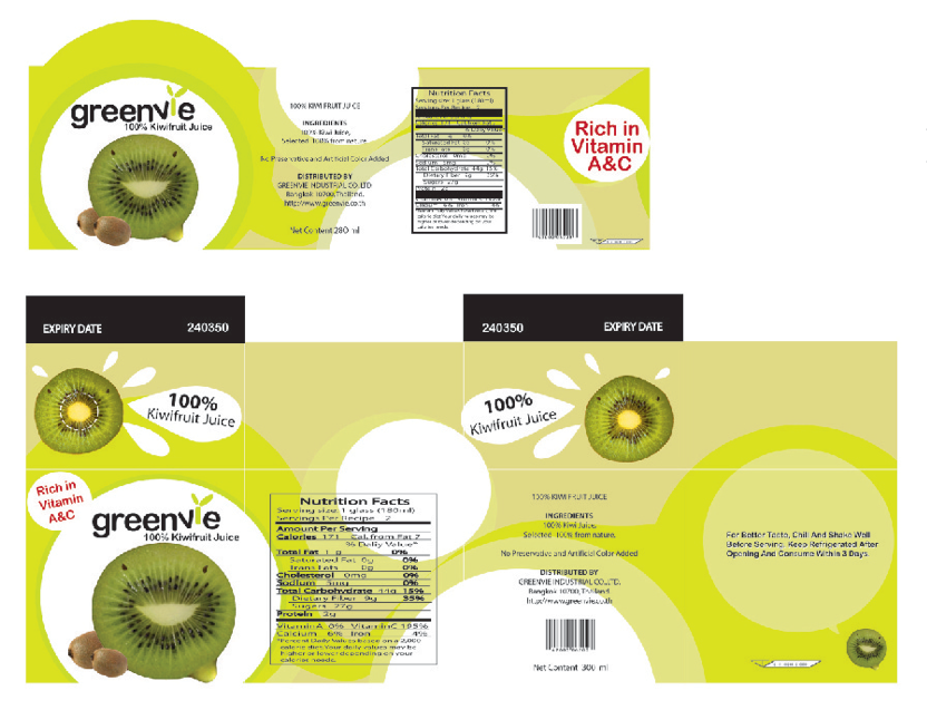
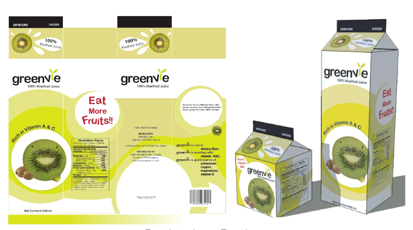
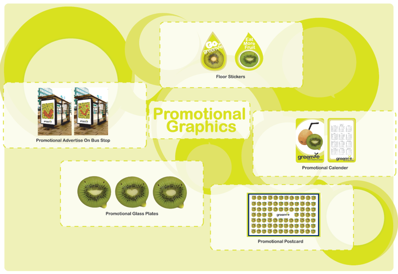
Greenvie Co.Ltd is the producer and exclusive distributor of New Zealand Kiwifruit Juice in Bangkok which Targeting teens and children.
Concept Design
The key of design is using shape of of kiwi seeds to create the different charactor of kiwi funny faces called "Mr. Greenvie" which draw attention effectively from teens and childern. Mr.Greenvie face was applyed with graphics design in different ways. For example, on the juice carton, Mr. Greenvie make his mouth into an "O" shape at the straw hole punch or give the customer a big smile on the label to create the feeling of friendly. A bright green colour with bubble shapes of packaging communicate the mood of freshness and lively of the brand.
Bangkok 2032
Logo and promotional design
Year 2012
Concept Bangkok, The forest of people thinking.
Project Information
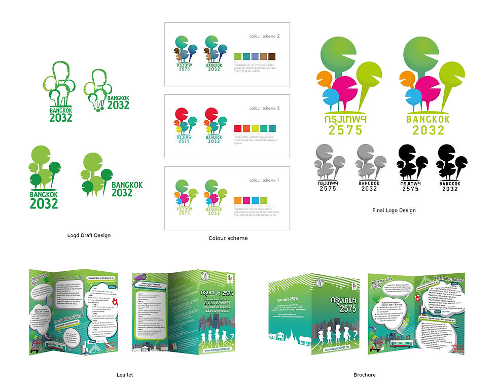
As the Bangkok Metropolitan Administration and Chulalongkorn University’s Faculty of Political Science are jointly implementing “Looking Ahead to Bangkok in 2032” project, six public discussion sessions will be hosted in various areas to brainstorm creative ideas and different viewpoints from academics as well as delegates from public and private sectors on how to develop Bangkok in the next 20 years to meet the future needs and lifestyles.
Design Concept
As the project objective is gathering viewpoints from different sectors in community. The logo illustrate the cooperation by using the shape of the forest combine with the icon of speaking people to represent "The forest of people thinking". It means the future of Bangkok city will be created by ideas from people in community. The colours using is derived from Bangkok logo to show connection between campaign and Bangkok Metropolitan Administration.